Monday, December 24, 2012

merry merry

Wishing you all a safe and happy holiday filled with friends, family, laughter and love.
 

Friday, December 21, 2012

let us bring him silver + gold

Yes, I made a cheesy Christmas song reference in the title of this post but I just couldn't help myself! I love the holidays and coincidentally my current design conundrum involves the delicate art of mixing metals. I remember over a decade ago thinking I would never like gold, it was for "old people." Either times have changed or I have become one of those old people (no comments from the peanut gallery please) because I love all shades of gold. In fact, I have been wearing dual-tone jewelry for years now.

David Yurman earrings; I almost never leave home without them

I'm a little stuck when it comes to the correct way to mix metals within my own home. As you've seen in previous posts (here, here and here) a lot of our fixtures and appliances are chrome. While I wouldn't change a single decision that we've made thus far I want to warm up our open floorplan by adding some gold tones. Instead of simply choosing accessories in one color or the other the trick to a smooth combination is finding key pieces (like those earrings) that are both silver and gold. They introduce the relationship and will then provide continuity as you layer solid items in the room. Here are a few of my favorites:


via

Do you think I should stick to one metalic tone or go for the combination? If you like the combo, how do you go about mixing metals in your living space?

Friday, December 14, 2012

holiday tablescape

I'm so excited. This is the first holiday season my husband and I have a dining table so, naturally, I've got three dinner parties on the books. Thankfully the Barefoot Contessa was available to help me plan the menu but when it came to my tabletop I was in need of inspiration. Feining for luxurious neutrals, I turned to the fabulous design blog Sacramento Street. I'm obsessed with the way Caitlin uses neutrals to create traditional settings. White can often take on a more modern feel but she manages to keep it current yet timeless.

As luck would have it she recently created a wonderful tablescape for a contest put on by the monogram king Mark + Graham (a perfect place to purchase hostess gifts, btw). From the flower arrangement to the antlers, it's perfect for my holiday entertaining.


Tip: To make neutrals more sophisticated and luxurious, layer them. You don't need "pops of color" or crazy patterns to make a room feel interesting. A few strategic accessories will complete and ground your look, like the black and gold charger plates above.

* This advice came recently from an interior designer I know well regarding my own home. Thanks Mom!

Thursday, December 6, 2012

towels

I have a strange obsession with bath towels. I have been known on multiple occasions to choose hotels based on the quality of their cotton. Let's just say I've done some research.

Remember this post when I told you Macy's Hotel Collection was the bees knees? Well I stand by that statement, however, someone has successfully knocked them off! Target (that's pronounced Tar-jé) has created a luxury line under it's proprietary Fieldcrest brand and these towels are legit. Instead of the steep $12 to $40 price tag you can snag these fab alternatives for $9 to $20. They come in solid colors or white with stripes and the line even includes bath sheets. I'm always looking for ways to save some money without compromising quality so I just had to share this with all of you!


**Disclaimer: Copper + Walnut is not liable or responsible for guests who accidentally "miss their flight" or linger longer than they are invited. We can not control the power of these towels.

Monday, November 19, 2012

thankful


Even though I try to be thankful 365 days a year it doesn't always happen. Life gets in the way, stressful events occur and I get thrown off track. I'm looking forward to a trip to Ohio and a few days to simply give thanks for all of the amazing people in my life. Ironic, perhaps, coming from a person who loves to fill homes with "things."


As I look back on all that has happened this year I am most thankful for the support and love that I've recieved. Publically showcasing my passion for well-made furniture and all things design has not only opened new doors of opportunity and friendship for me but it has also strengthened existing bonds in ways that I didn't expect. Next year is going to be an exciting time for me so if you are reading this post thank you. I've got some awesome things in store for 2013 and that new logo sitting at the top of the screen is only the beginning. Blog face-lift, here I come!  

Happy Thanksgiving!


Monday, November 12, 2012

change, change, chaaaaange

I'm sorry for being MIA lately. Over these last few weeks I've been making some big life decisions and while I'm not quite ready to share all the details just yet, I will tell you that I am positioning myself to make a pretty big, scary and exciting leap.


Please forgive me if my posts for the rest of 2012 are a bit sporadic and chaotic. I will be busy getting all of my ducks in a row for some big announcements in 2013.


This is a poster that hangs in my home office and I love it because it reminds me that it's ok to fight for my own happiness. It doesn't make me ungrateful for my past but rather it empowers me to take hold of my future. So much of what I am about to embark on has been made possible by the people reading and supporting my blog, so thank you from the bottom of my heart! I can't wait to share more of my next adventure with you.

Wednesday, October 3, 2012

glitter guide

"My house, like my wardrobe, features a mix of high-end statement pieces and thrift store finds, vintage and modern, and unexpected color combinations."

-Marlien Rentmeester

For fashion trends and interior design tips one of my favorite blogs to follow is the fresh, and sparkly, Glitter Guide. Fashion and design are such personal forms of expression, it's only natural that they intertwine. I'm obsessed with the "style at home" segment because it features insight and advice from highly successful, inspirational women in tandem with photographs of their living spaces. Presenting a relatable departure from the glossy pages of styled magazine spreads, the homes manage to be both functional and tres chic. The feature this week is no exception.

It's not often that I come across someone whose personal style and interior design approach are so in tune with my own. Phillip Lim has never personally complimented my jewelry and I might not have the guts to put leopard carpet in my guest room (yet)  but it's always reassuring to have a design philosophy in common with someone so talented.  As the west coast editor of Lucky Magazine, Marlien Rentmeester is know for her eclectic taste "mixing Zara and Marni, Topshop and vintage designer." Combining old with new and vintage with couture is a look I personally strive to achieve and am consistently in awe of those who master it effortlessly.

As if Marlien wasn't fabulous enough, she also has her own fashion blog


If I had to define the style I am aiming for in our home it would be very similar to Marlien's. Rather that following a strict color scheme her home appears to be collected; almost as if each piece has its own story.


To me this house represents the perfect balance: comfortable and casual enough for everyday family living yet chic enough to throw an adult-only dinner party on a whim.


...and I wasn't kidding about the leopard carpet.

all photos via

Monday, September 24, 2012

j.crew home


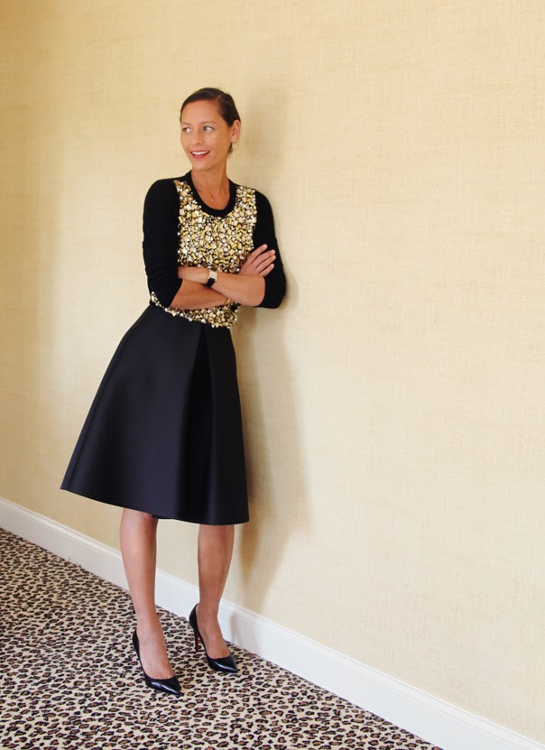
To me there is an inherent link between fashion and design. I'm not saying that everyone designs the way they dress but just like fashion, interior decorating is all about personal expression. I am often inspired by looks I see in fashion blogs, magazines and even on the racks of my favorite stores.

For instance, if J.Crew had a home store my house would be finished and I'd be broke. It's the go-to label of my generation and for good reason: they have mastered mixing fresh colors and patterns, use fabulous and diverse material and effortlessly blend classics with trends. This is exactly what I want my house to be. J.Crew, if you're reading this, please open a home store and hire me to buy for you. Ok, thanks.

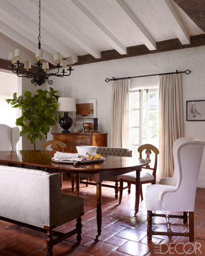
You might recall that my initial living room inspiration board was full of neutrals. Well, I'm over it. In a moment of fashion- inspiring-interior design I put together a collection that is my interpretation of what a J.Crew living room might look like.


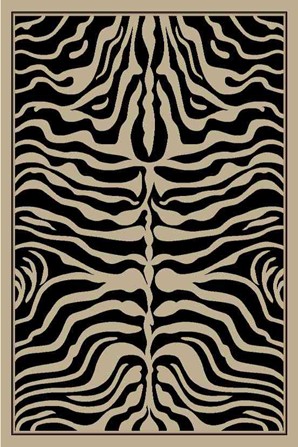
2. Animal Print Throw Pillow with Red Orange trim, Century Furniture*

3. Santiago End Table, Arteriors*

4. Chesterfield Leather Sofa, Century Furniture*

5. Italian Gilt Side Table, Jonathan Charles* 

6. Horn Tray, Regina Andrew*

7. Kingston Driftwood Cocktail Table, Arteriors*

8 & 9. Paisley Throw Pillow with Green Leaf trim, Century Furniture*
Red Orange Quilted Throw Pillow, Kravet*

10. Liz Goldleaf Mirror, Worlds Away*

*available to the trade only. If you are interested in any of these products please comment below or  email me at copperandwalnut@gmail.com

The patterns, textures and colors are what really make this look scream J.Crew 
To create a perfectly mixed and matched collection I had to step away from the mainstream retail shelves. J.Crew finds their patterns and fabrics overseas in obscure textile mills and markets; I simply did the interior design equivalent of that. 

Use trim on pillows to pull multiple patterns together
It's incredibly difficult to find the exact group of colors in one pattern. Trim allows you to add a color that unites the overall look. For instance, the animal print (above) doesn't have anything in common with the other fabrics at baseline. Add some red orange trim and all of the sudden it becomes part of the collection; it makes sense. 

Don't be afraid to seek out a partnership with an interior designer, even if you are on a budget 
I didn't begin this living room board with the intention of using product that is only available to the design trade, it just happened that way. In order to capture the one-of-a-kind style that J.Crew does so effortlessly it's important to partner with the professionals; they have the key that unlocks an entire world of furniture and decor that mainstream markets don't have access to. 

...I have a feeling the items on this inspiration board just might find their way into my living room.

Wednesday, September 19, 2012

first impression


“If there isn't a place to put your coat, the house does not feel real.”
Steven Gambrel, Interior Designer


If there hadn't been a name after that quote I would assume it came out of my husband's mouth.  We always fight the battle between beautiful and practical. I firmly believe a space can be both and that is my goal for our entry way. It's the first thing people see when they walk into your home so I would like ours to be both impressive and inviting. Since it's important in any marriage to compromise I am going to put two entry way looks together and we will attempt to end up with something somewhere in between.


His
*It's important to note that my husband did not actually sit down, scroll through thumbnails of furniture and put this collection together. Had this happened I would not be writing this post, I would be waiting for the world to end. I took the liberty of asserting what I think he might pick.


via (interior designer)


via (interior designer)


Hers  
This collection reeks of estrogen and I'm ok with that.


The Compromise


I have literally had this post sitting in my "draft" section for weeks now. I can't make up my mind. In an attempt to help, my husband asked me to prioritize my design purchases in order from "can't live without" to "could wait until next year." I was surprised to see our entryway towards the bottom of that list. 

I learned a good lesson here. Anyone who is passionate about design knows the thrill of a complete room. I am dying to throw our first party in a space that I deem fabulous and finished but we simply can't afford to do that so I must find that thing called patience I've been hearing so much about. Wish me luck!

Tuesday, September 11, 2012

lustful living: spanish-style ranch


If I had unlimited funds and the ability to build a home from the ground up here in Texas, this is what it would look like. From the ceiling beams to the terracotta tile to the iron railing I am in love with the character of this Spanish-style Ojai, California ranch.  


all photos via

Thursday, August 30, 2012

designers block


We've survived the move, unpacked most of our belongings and even lived through construction. You'd think (or at least I thought) this would be the shining moment for any design fanatic. Our space is light, bright and ready for personality...except I stand here, in front of a blank and beautiful canvas, frozen.

I'm afraid to paint the wrong color, choose the wrong fabric or spending money on something that I might regret in a year. I've got a classic case of designers block. What's a gal to do? Between Houzz, Pinterest, blogs and flash sales at One Kings Lane I do not lack inspiration so I began compiling and pinning images that caught my eye. Instead of worrying about color, coordination or what rooms these pieces would go in I just let my gut instinct lead me.  I have completely rejuvinated my design spirit!  

Below are a few of my favorite finds that accurately represent our personality and will add character and color to our home.

I am learning to accept my new status as a Texan. While I refuse to kill, stuff and hang dead animals on my wall (it's seriously creepy, especially when you leave the eyeballs in) I love the idea of using throw pillows as a  tongue-in-cheek nod to my new hometown.


You might remember this fabric from an earlier post. I still love it and think it's the perfect feminine balance for those ultra masculine antlers.

both fabrics via

Love the colors and modern flare of this C Wonder dish. Elephants are also my favorite animal...behind French Bulldogs of course.  

I am dying to wallpaper a room. The powder room to be exact. Sadly this is impossible due to our textured walls (and the price of this paper, yikes) however I refuse to let that stop me. I will find a way to use this Cole & Son pattern, it's just too fabulous to pass up:  


 As I mentioned in an earlier post, my Dad is the handyman of all handymen. He flew into town for a long weekend and POOF we had a new, hand crafted fireplace surround. I'm saving the unveiling for a later post (as I might be a little behind on applying that final coat of paint) but regardless it's gorgeous. The only thing missing is this lovely mirror hanging above it:


via

I admit it, I like animal print. Not in the silk leopard bedsheets kind of way, but in the zebra back-entry accent rug kind of way: 

Mine came from One Kings Lane and is no longer available.
similar via

What do you have in your home that is "totally you?" How do you let your personality shine through in your living space? I'm dying to know...

Friday, August 24, 2012

before + not-so-after: bathrooms


Describe your bathrooms in one word: white.

Our bathrooms are far from complete. They lack both color and character, but phase one of mission upgrade was a success. The biggest splurge in this project was flooring. We took 3 bathrooms and one laundry room from standard vinyl to tile that we found and purchased ourselves. We had the same group that did our kitchen take on this transformation and it was absolutely worth the time and money. While we still have a ways to go, the first round of updates have left our bathrooms feeling very bright and clean with a touch of lux. 

phase one included:
- tile flooring (basketweave carrara marble & white hexagon merola )
-  rope knobs (in chrome)
- Macy's hotel collection towels (hands down, the most amazing towels I've ever used)
- Restoration Hardware extra long shower curtain (guest bath, makes a standard tub shower look fancy)
- guest accessories (tray, glass storage, bath products)
- extra large glass shower (instead of including a tub in the master bath)

future phases will include:
- paint walls in the master bath and powder room (light grey)
- accessories (storage baskets, art in the powder room)
- new mirrors (in guest and master, I'm not a huge fan of the standard sheets mirrors)
- new lighting (we opted for the standard options in hopes one day upgrading in all three)
- window treatment in the master bath (we frosted the lower half of the window, you're welcome neighbors)
- crown molding in the master


{before: master}


 {after phase one: master}


{before: guest bath}


{after phase one: guest bath}


{before: powder room}


{after: powder room}


My favorite element has to be the basketweave carrara tile.

I'm struggling most with how to dress up the powder room since the tile is rather busy and it's such a small space. Has anyone seen any fun, small bathrooms lately? The next phases of transformation will happen as buget and time allow, so stay tuned for future project posts!