Wednesday, February 27, 2013

oscar worthy interiors


As I've said before I believe fashion inspires interiors and interiors inspire fashion. The first glimpse of a red carpet star all dolled-up and that feeling you get when you walk into a well-styled room are similar in my mind. So, instead of a best dressed list I've chosen some of my favorite gowns and paired them with cooresponding interiors.  

Amy Adams


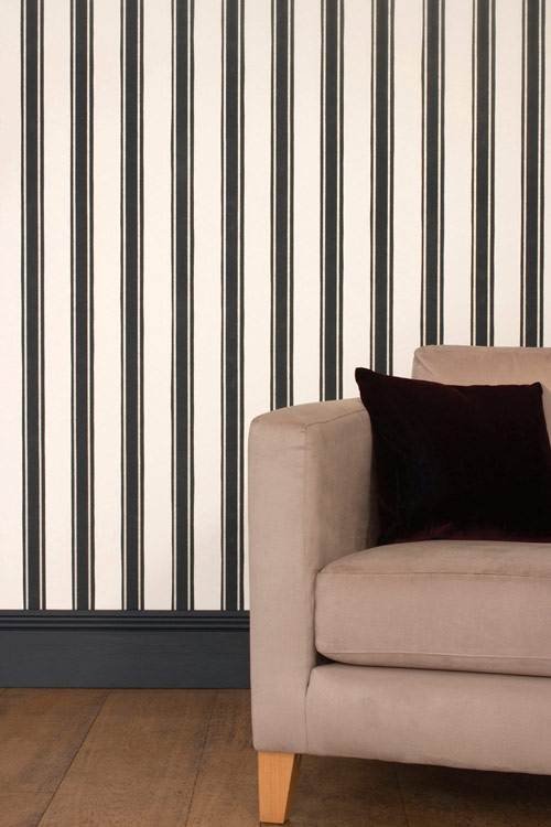
Let's be honest, this duvet would have been the obvious choice, but I'm not going for a doppelgänger here, just a space that evokes a similar feeling. 


Beyond the gorgeous waterfall of fabric cascading down Amy's gown, the princess style and sweetheart cut of this dress is very formal and traditional. 


Jessica Chastain


 If I close my eyes and think of what a movie star should look like, this is it. Channeling old Hollywood glamour this nude and gold space is both timeless and glam, all that's missing is a red lip. 
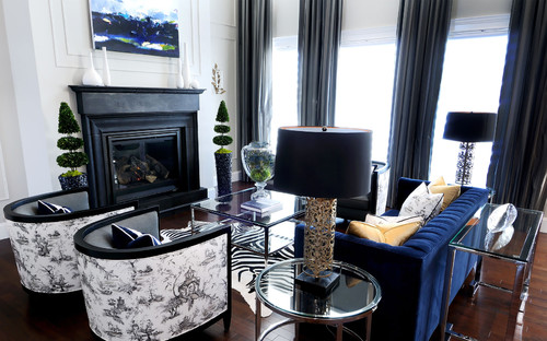
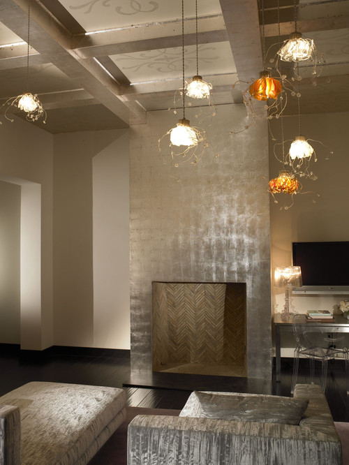


Salma Hayek 


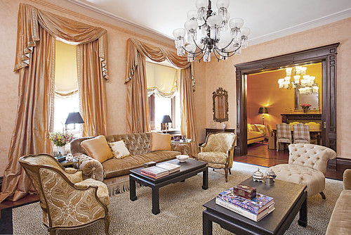
This pick was a surprise to me, and I think she killed it. Salma usually opts to show off her best "assets" but with this 90's inspired high neckline and sleek velvet bodice she was sexy in a much more demure way. It's no surprise Ralph Lauren chose the same black and gold combination for his study.  


Jennifer Lawrence


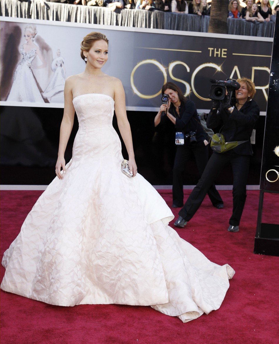
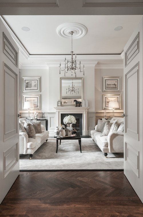
Jennifer is so endearing and personable with {not to mention} one of the hottest bodies in Hollywood she could wear a paper bag and look gorgeous. While this dress wasn't my favorite of all her award show choices it's nice to see a younger actress choose something so traditional and timeless. 


via 

Amanda Seyfried 


High necklines are back! This was apparently made specifically for Ms. Seyfried and with good reason, she looks incredible. Pale lavender is gorgeous with her coloring and, to me, the gold pattern adds a bit of asian flare. 


Naomi Watts


I want to look this good after having two kids. This dress is a true piece of art and fits her body perfectly.  It's a little unexpected and very on trend with the shimmer and cut outs. 


Charlize Theron


I saved my favorite for last. Talk about statuesque, the structure of this peplum gown only enhances the chiseled yet feminine physique underneath.  Not to mention, the girl can rock short hair like I've never seen. She's sleek, modern and my new inspiration to workout daily. 


Photobucket


Wednesday, February 13, 2013

Elle Decor Trends: Beyond Emerald in 2013

With each new year comes new design trend predictions. If you read any interior design blogs you already know that Emerald Green was chosen as the Pantone color of the year. We will be seeing shades of green in everything from finishes to fabrics this coming Market and I have to say I'm delighted such a versatile, natural color was chosen. 

One of my favorite interior design magazines and websites, Elle Decor, went beyond color and predicted the five major design trends for this coming year. Broken down into basic categories I will show you how I'm practically applying the trends of 2013 in my own home.  

1. Brass

From gilded gold to true brass I am fully embracing this trend. One metal does not, however, hold the key to my heart. While brass might remind you of bad early 90's decor at times {yikes} using multiple shades and mixing it with other metals {as seen here} will keep it modern and fresh. 

Our newest addition in this category is a family room cocktail table from Global Views. It's a substantial, heavy piece but the eglomise {gilded glass} top and brass finish keep it feminine and demure. 


2. Green

I know, I know, Pantone has declared Emerald the supreme shade of Green this year but for my own home application I am going to stick with Celadon. Green is actually my favorite color and a shade closer to emerald is one I often choose to wear but when it comes to large upholstered items for my home I tire of things too big or bold. I am opting for a more subdued tone of green for our family room and will layer textures and colors to create personality and life. 

Lesson learned: Never be afraid to modify a trend to make it work for you. Just because something is popular doesn't mean it is the right fit for you and your home. Use trends to guide you but don't be afraid to tweak them so that they reflect you and your individual style. 


{celedon, emerald}
{family room chairs}
{lumbar pillow on the leather chesterfield sofa}


3. Embellished Walls

I have not made it a secret that I love wallpaper. Sadly, our walls are textured here in Texas but that won't stop me from putting pattern on my walls {stay tuned for a future post on that} or from daydreaming. Here are a few of my favorites from Cole & Sons and Farrow & Ball; I tried to include something for everyone: 

{I professed my undying love for this pretty, feminine paper here
{this reminds me of my study abroad trip to Florence, perfect for a study} 
 via


{it's technically ocelot, but I am loving this animal print}


{trend combo! I could see this in a fabulous powder room}


{left: preppy and classic goes anywhere. right: love this for a bedroom} 


{a perfect lead in to our next trend...lace} 

4. Lace

I won't claim to love lace. Perhaps my former tomboy self feels it's just too girly or maybe it's because I now share a space with my husband and I don't want our home to feel too feminine. Whatever the reason, I am not naturally drawn to it. There is, however, one exception: our master bedroom bedding. I'm strangely obsessed with the delicate romance of Bella Notte


 {our bolster pillow is top left and the throw that I lust after is top right, sigh}
 via


5. Shades of White

Cream, off-white, bone, beige, sand. Unlike lace, this trend might have been created specifically for me. As someone who tires of big, bold patterns and colors I avoid creating a stark, lifeless space by layering these neutrals with various patterns and textures.  


So, tell me. What are your favorite trends for 2013 and how are you incorporating them into your space?  

Photobucket


Wednesday, February 6, 2013

phDesign: black + blue


There is something so classic to me about blue and black. This can be a tricky pairing if the colors are too close to one another, so for my first phDesign post I am going to share a few things to remember when working with this combination:
  • the blue needs to be on the border between royal and navy
  • make sure the shade is a true blue, nothing with too much green or purple in it
  • stick with a basic black
  • use multiple textures; you add interest to the room and avoid clashing colors
  • mix metals with your combo to add a lux look
  • to keep a space feeling bright and open, stick with white walls
  • to make a space comfy and cozy paint the walls blue and coordinate the window treatments
When done right you can achieve a truly sophisticated "city chic" look. This marriage of colors takes a trained eye to accomplish, but whether it's in fashion or design the results are always high-end and luxurious!


{this purse recently found its way into my closet}


Friday, February 1, 2013

lust list: family room decor

I'm in Minneapolis this week, knee deep in fabric samples, and have made some exciting new custom purchases for our home! I'll save those details for another post but it has totally put me in dream-mode when it comes to our family room. Since we can't finish it all in one fell swoop I've compiled my lust list for the week around things I would like to include in that room. Some items are only sold to the trade (you just might be seeing more of these brands in the future, wink wink) and others are everyday retail. Hope you enjoy these pretty pieces as we head into the weekend.


via
{I would purchase the twin xl and use it as a throw}
 

Photobucket